Project snapshot
A simple, expressive identity for an EV charging network that is making charging your car as routine as charging your phone.
01The challenge
With a background in real estate and an eye toward the future, Chargie is building the most intelligent, reliable EV charging network by a mile. With an aggressive growth plan in place, they needed a brand that could keep pace with their business, one that works for modern commercial buildings, multifamily communities and the growing number of EV drivers.
02The approach
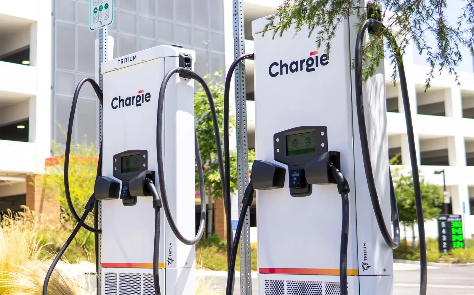
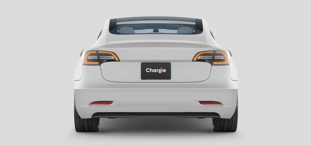
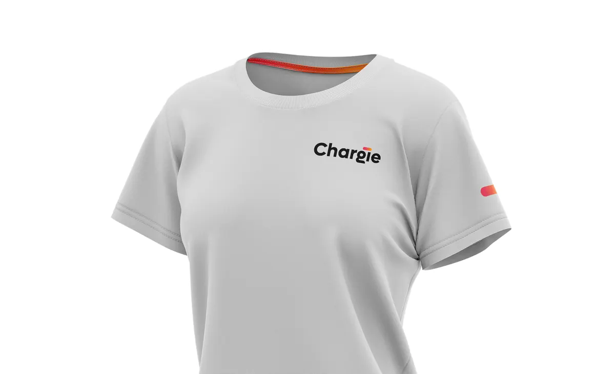
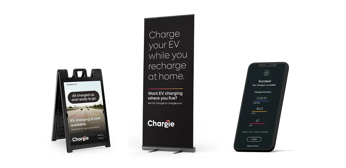
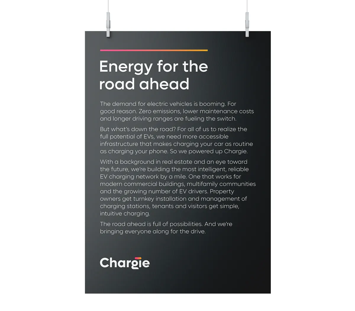
We powered up a brand that's full of energy. Chargie is building the infrastructure needed to make charging your car as routine as charging your phone, so we developed a simple, expressive identity that's as confident as it is inviting. The power bar symbol in the word mark connects the ear of the 'g' with the dot of the 'i', a visual cue that guides people through the experience in app tiles, headlines and CTAs. With a new brand that's all charged up, the road ahead is full of possibilities.
03Brand / UX / design system